Graphics for More than Digital: A Checklist
By Anne Kleinman
May 23, 2024 | 3-minute read
Technology Management Graphic Design and Branding
Communications
How do you know if the new logo you’re about to approve will look smashing beyond your website and other digital assets?
The most important thing to keep in mind is that the presentation of logos, colors and design on a screen is fundamentally different than the presentation on any other tangible media.
Here’s a quick rundown of considerations before signing off on your new design.
Logo Design
A few things to look for with your new logo:
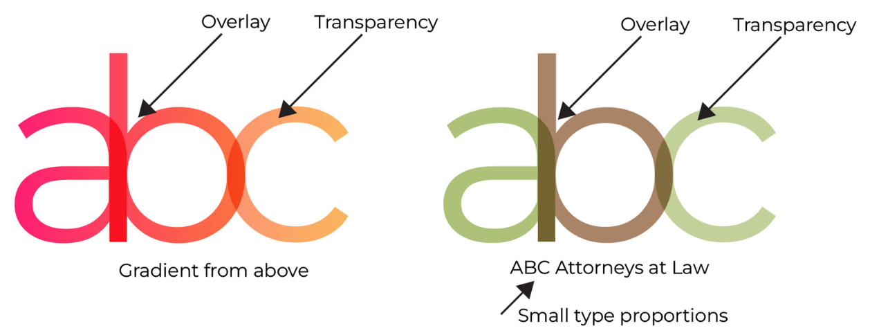
- Colors should have a solid option, not only gradients.
- There should be no overlays or transparencies. You should also make sure that there is small space between colors.
- Proportions — the total look of all of the elements in the logo should not be overly wide or overly tall with small text. If you have small text, go for square or round options and have an alternative version with no small type.
If you do want to include any of the above design elements in your logo, such as a gradient or overlay, just be sure to have alternative standard variations that maintain the brand and can be used for printing in other formats besides on screen.
Branding Packages
The second thing that you want to ensure when contracting for a new logo is that you get everything that you’re paying for. A branding package should include the following:
Colors, Delineated for Each Print Method
- Spot colors (also known as Pantone colors) are used for screen print, pad print, etc.
- CMYK colors (full color print) are used on paper and with digital printing equipment.
- Hex colors (for digital assets) are used for anything that will be on a screen. A lot of designers will also supply RGB colors.
Logo Variations
- You should be getting both full color and one-color versions of your logo, as well as variations appropriate for various sizes including icon or emblem, favicon and small spaces (those small items should have bigger spaces between elements so that they don’t fill in).
Fonts
- The names of the fonts that accompany the logo, as well as their hierarchy and appropriate placement and usage.
Usage Guidelines
- These include spacing of the logo and text as well as formats for full-color, single color, spot color and color combinations. It should also include guidelines for minimum sizes of text.
File Formats
- Make sure to have a full suite of options available, including AI or EPS, PNG, JPEG, SVG. Different applications will require different file formats.
Physical Items
- Consider a full inventory of where the logo may appear, including but not limited to: email signature, digital letterhead (template for email attachments), print-ready design for physical letterhead and business cards.
Usage Mock-ups
- Most designers will provide you with mock-ups for various tangible products, including the letterhead and stationery, a pen, a hat or jacket, or perhaps a mug. These are only to give you a sense of how your new logo will look on tangible products. It should not be relied upon for actual production suitability.

Logo creation and redesign can be a significant investment of a firm’s time. By considering a full inventory of needs upfront, you’ll ensure its thoughtfulness and quality is maintained, avoiding any issues down the road.
Learn More About Technology Management with the Third Edition of the LMA Body of Knowledge
The content in this feature correlates with the Technology Management domain in the LMA Body of Knowledge (BoK). Dive deeper and access the latest edition of the BoK online.
The Third Edition of the LMA BoK showcases enhanced expertise across every domain, introduces new competencies in Client Services, Communications and Technology Management, features more advanced skills across all domains and broadens coverage of competitive and business intelligence skills. Plus, it emphasizes a stronger commitment to nurturing diversity, equity, and inclusion across the entirety of the BoK. Learn more.
|